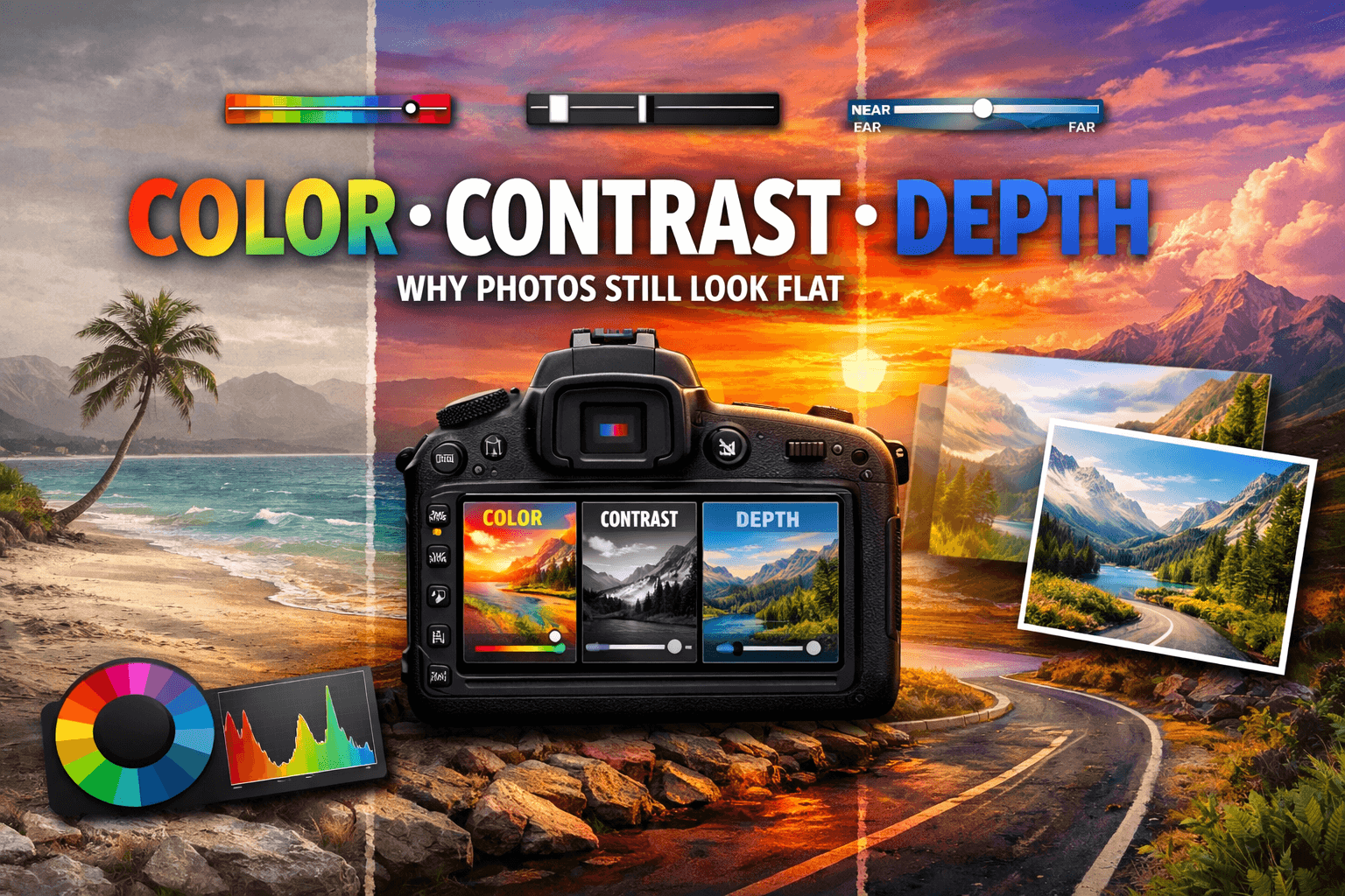
Color, Contrast, Depth — Why Technically Good Photos Still Look Flat
Many photographers know the feeling: the image is sharp, the exposure is correct, the focus is spot on—and yet the photo somehow feels lifeless. This is rarely the camera’s fault. It’s because most image editing programs are either too complex or too superficial—and hardly anyone really knows how to retouch images without wasting hours. Mood isn’t created when the shutter is released. It develops afterward.
What “technically correct” does not mean
A photograph can meet all technical parameters and still have no impact. Why? Because cameras don’t capture mood—they measure light. The human eye, on the other hand, interprets scenes, weighs contrasts, and reacts emotionally to color temperatures.
A gray autumn sky over a city park looks melancholic in real life. The same shot, unedited, on a monitor? Flat, colorless, generic. The camera has delivered what it can. The rest is up to the editing process.
The invisible role of color correction
Color is not just color. There’s a world of difference between a “neutral white” and a slightly warm white—barely measurable visually, but clearly felt emotionally. That’s precisely where it’s decided whether an image has an impact.
Color correction doesn’t mean distorting colors. It means restoring what the eye saw on location—what the sensor couldn’t capture. Skin tones that are too reddish or too green. Sky blue that drifts into grayish-violet. Green areas that look like yellow grass on the screen.
These are not camera errors. These are physical limitations of sensors — and solvable problems in post-production.
Contrast: the underestimated depth sensor
Without contrast, an image appears flat—that sounds obvious, but it isn’t. Many photographers simply increase the global contrast slider and wonder why the result looks harsh and unnatural. The problem: global contrast treats all areas of the image the same.
Local contrast is the opposite. It emphasizes structures where the eye expects to find them—in faces, textures, and landscape foregrounds. And it leaves flat transitions in the sky or background untouched.
Control shadows and highlights separately. Deliberately bring out the midtones. That’s the difference between a photo that looks like it came straight from a camera and one that looks like it was taken by a photographer.
Image mood: Why color grading is not a luxury
Professional photographers and filmmakers have been working with color grading for decades—the targeted tinting of shadows, midtones, and highlights into specific hues. This gives images a signature, a mood, a distinctive character.
A light turquoise in the shadows and warm orange in the highlights creates the classic cinematic look. Cool blue tones across the entire image create a businesslike, modern feel. Warm yellow undertones in the midtones? Summer, nostalgia, warmth.
This might sound like a gimmick, but it’s strategic. Consistently using the same color scheme throughout a series of images creates coherence—and coherence is what distinguishes professional portfolios from amateur collections.
Common editing mistakes that make photos look flat
Even experienced photographers fall into the same traps:
- Too much saturation instead of color correction — increasing saturation doesn’t mask color problems, it intensifies them.
- Global contrast instead of local processing leads to blown-out highlights and crushed shadows.
- Ignoring white balance is one of the most common causes of unnatural skin tones.
- Excessive sharpness doesn’t make images crisper, but grainier.
- Ignoring the processing order — those who sharpen first and then change the contrast are building on an unstable foundation.
These errors do not occur due to a lack of knowledge about the motive, but due to a lack of tools — or tools that are too complex for fast workflows.
How Luminar Neo changes the process
This is where Luminar Neo comes in. The program combines classic editing tools with AI-powered functions that address precisely the problems described — without requiring hours of work on curves and masks.
The AI automatically analyzes the image: it recognizes the sky, skin, vegetation, and background—and enables targeted adjustments for each area separately. Want to increase contrast in the foreground without oversaturating the sky? One slider. Want to correct skin tone without shifting the surrounding colors? Directly in the retouching module.
Luminar Neo is not an autopilot that makes decisions for you. It is a tool that gets you to the point where creativity begins faster—instead of getting bogged down in technical preparations.
Results you see immediately
The practical difference becomes apparent quickly. Images that used to take twenty minutes to edit can now be brought to a professional level in a fraction of the time. Not because quality has become cheaper—but because the path to achieving it has become shorter.
Anyone who takes photos that are more than just “technically correct” should try Luminar Neo. The trial version shows in just a few minutes what’s possible — and why flat images are usually not a camera problem.